Results for articles with tag 'visualization' (5 total)
Our clients are demanding more and more interesting looks at data from us, so we better have a nice way to communicate all this stuff. Aside from the creative department, not many of us have the visual skills to make this work, so we are going to rely on existing tools to make this happen.
One example is Modest Maps which requires a little bit of technical expertise, but can be used to great effect. Take a look at this which shows the spread of Wal-Mart over time.
Going back to the seductiveness of data visualization, at it's best it can become great content as this BBC series, Britain from Above shows. If you get it right it can fascinate, delight us and help us to better understand our world or our business.
Posted by Ed Cotton
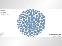
Here's the big map...
Here's an isolated look at the Nike relationships within the map....
It raises some interesting questions..
1. How do brands connect to bigger themes, interests, ideas and emotions?
2. How are brands leveraging those connections?
3. How do brands enhance those connections?
4. How do brands bring communities together?
While many have questioned the role of brands in social networks and communities, Shared Egg illustrates that people can be connected and linked by brands. It still remains to be seen how brands best leverage this opportunity to activate and build out these connections and these communities.
Posted by Ed Cotton
Now, Mac Funamizu a web/graphic designer working in Tokyo, Japan has developed some great visuals showing some interesting concepts around the future of search.
Posted by Ed Cotton
It's a way to visualize the brands we interact with over the course of the day. It's really Brands in Your Day.
Planners love this stuff because it's a nice way to bring thinking to life and it's great to be able to see the time when brands are being used this could even have media implications for example.
Perhaps there's another version of this which examines the depth and scale of relationships individuals have with brands something relating to distance.
Shown below is the timeline from Doug Jaeger of Happy Corp.
Posted by Ed Cotton


Articles for tag visualization (5 total).
